
RETECHNOLOGY PREMIUM MARKETPLACE RELATED PRODUCTS | WEBINARS | SPECIAL OFFERS


You are viewing our site as a Broker, Switch Your View:
Agent | Broker Reset Filters to Default Back to ListResponsive Real Estate Websites: Join the Club!
April 11 2013
 Have you heard the news? Mashable.com – a leading online technology and news source – has declared 2013 the "year of responsive design." What does that mean to you? If you're already a Point2 member, it means you're ahead of the pack!
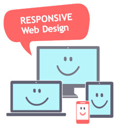
Responsive design is a type of web design that results in optimal viewing on all screen types across all devices. Responsive web designs resize and reformat page content in response to screen size and resolution.
In short, a responsive website is one that looks good and performs well on traditional computers, tablets and smartphones. It's one size fits all – no separate mobile version required!
Major brands are converting their websites to responsive designs this year. For some, this can mean hiring or developing a new web team to do a complete overhaul over the course of weeks.
Top 3 benefits of responsive real estate websites
aka, why you should start thinking about a mobile-friendly theme
1. Great for SEO
Responsive design is Google's recommended configuration. If that's not enough to get you going (though we really think it should be), consider that responsive websites tend to appear higher in search rankings than sites with mobile versions. If you have one responsive, mobile-friendly site and your competitor two versions of their site – a standard and a mobile URL – your single site will probably be indexed faster.
2. More User-Friendly
Users prefer responsive sites because they get access to the same presentation, content and functions no matter what device they're using. If you consider that many potential buyers may start their home search on their laptop and then switch to their smartphones throughout the course of the day, it's only logical to make sure they have the same user-experience from one screen to the other. Having a separate mobile site – that usually has less content and different navigation – doesn't make sense. A responsive design that performs the same across all devices can decrease your bounce rate.
3. Less Work
Although switching your site to a mobile-friendly, responsive theme may seem like a lot of work now, maintaining one site that works on all devices is a lot less work than maintaining multiple versions of your site in the long run. If you have copy updates or are running a promotion, you only need to edit your content once to have it appear correctly to all viewers, regardless of which device a prospect uses to access your site.
To view the original article, visit the Point2 Agent blog.