
RETECHNOLOGY PREMIUM MARKETPLACE RELATED PRODUCTS | WEBINARS | SPECIAL OFFERS


You are viewing our site as a Broker, Switch Your View:
Agent | Broker Reset Filters to Default Back to ListResponsive vs. adaptive: optimizing your mobile website
July 17 2013
Did you know 65% of today's smartphone users use their devices to make purchases? Additionally, tablet penetration in the US market is up nearly 50% since 2012. It is even expected that tablets will outsell PCs as soon as 2015. Within this expanding and unavoidable mobile device market, however, almost half of tablet users are complaining that business websites are not proficient enough for online tablet browsing. This may be due to pages that take several minutes to load, sites that have strange formatting on users' devices, or webpages that are just not supported by the user's device.
 Whatever the reason, it is clear that businesses cannot further postpone adapting their websites' compatibility for mobile devices any longer. We've been talking about the content side of things that we are experts in here at Onboard Informatics – but display is just as important as content. So how do we provide these mobile users with the best experience possible? For the companies that already have successful mobile device platforms, they have either adapted a responsive or an adaptive web design approach.
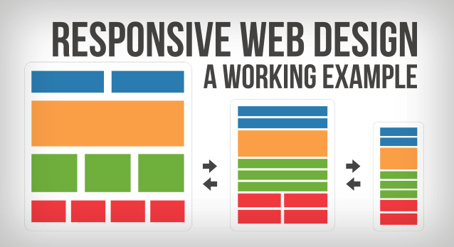
A Responsive Web Design, or RWD, is a singular webpage coding that adapts to the screen size it is appearing on. More specifically, the approach utilizes pre-determined size brackets that designate when and how the site will change as it passes through each bracket. Cycle to Work Calculator's webpage is a perfect illustration of RWD in action. The main benefit of RWD is that it is remarkably easy to manage. As opposed to having multiple different codings, the programmer needs only one. The main deterrent, however, is that advertising space and the attached potential revenue is quickly eliminated on smaller devices and screens.
 In contrast, many businesses may use an adaptive approach. With Adaptive Web Design, or AWD, multiple customized platforms are provided to optimize the site with each device it is being viewed on. While RWD downloads all the content and simply formats it to screen size, AWD will alter the website experience based on the user's device, screen size, and OS. For example, with faster phones more enhanced features will be displayed, while with older phones unsupported Flash features would not be provided. It may be more time consuming for the programmer, but it'll pay off as AWD supports mobile ads and will regenerate that lost revenue.
Regardless of your goals, there are plenty of resources online to get you started. To begin optimizing your Responsive Web Design, check out these tutorials. If you're leaning more towards the Adaptive Web Design, read the complimentary first chapter of this how-to book.
To view the original article, visit the Onboard Informatics blog.